2.3 - ANOVA model diagnostics including QQ-plots
by
The requirements for a One-Way ANOVA F-test are similar to those discussed in Chapter 1, except that there are now J groups instead of only 2. Specifically, the linear model assumes:
- 1) Independent observations
- 2) Equal variances
- 3) Normal distributions
For assessing equal variances across the groups, we must use plots to assess this. We can use boxplots and beanplots to compare the spreads of the groups, which are provided in Figure 2-1. The range and IQRs should be similar across the groups, although you should always note how clear or big the violation of the assumption might be, remembering that there will always be some differences in the variation among groups. In this section, we learn how to work with the diagnostic plots that are provided from the lm function that can help us more clearly assess potential violations of the previous assumptions.
We can obtain a suite of diagnostic plots by using the plot function on the ANOVA model object that we fit. To get all of the plots together in four panels we need to add the par(mfrow=c(2,2)) command to tell R to make a graph with 4 panels 23.
> par(mfrow=c(2,2))
> plot(lm2)
There are two plots in Figure 2-9 with useful information for the equal variance assumption. The "Residuals vs Fitted" in the top left panel displays the residuals (eij= γij - γ̂ij) on the y-axis and the fitted values (γ̂ij) on the x-axis. This allows you to see if the variability of the observations differs across the groups because all observations in the same group get the same fitted value. In this plot, the points seem to have fairly similar spreads at the fitted values for the three groups of 4, 4.3, and 6. The "Scale-Location" plot in the lower left panel has the same x-axis but the y-axis contains the square-root of the absolute value of the standardized residuals. The absolute value transforms all the residuals into a magnitude scale (removing direction) and the square-root helps you see differences in variability more accurately. The usage is similar in the two plots - you want to assess whether it appears that the groups have somewhat similar or noticeably different amounts of variability. If you see a clear funnel shape in the Residuals vs Fitted or an increase or decrease in the edge of points in the Scale-Location plot, that may indicate a violation of the constant variance assumption. Remember that some variation across the groups is expected and is ok, but large differences in spreads are problematic for all the procedures we will learn this semester.

The linear model assumes that all the random errors () follow a normal distribution. To gain insight into the validity of this assumption, we can explore the original observations, mentally subtracting off the differences in the means and focusing on the shapes of the distributions of observations in each group in the boxplot and beanplot. These plots can help us assess whether there is there a skew or outliers present in each group. If so, by definition, the normality assumption is violated. But sometimes the differen groups might contain different "non-normal" features and this can make an overall assessment complicated. Our real interest in these diagnostics is to understand how reasonable our assumption is overall for our model. The residuals from the entire model provide us with estimates of the random errors and if the normality assumption is met, then the residuals all-together should approximately follow a normal distribition. The Normal Q-Q Plot in upper right panel of Figure 2-9 is a direct visual assessment of how well our residuals match what we would expect from a normal distribution. Outliers, skew, heavy and light-tailed aspects of distributions (all violations of normality) will show up in this plot once you learn to read it - which is our next task. To make it easier to read QQ-plots, it is nice to start with just considering histograms and/or density plots of the residuals. We can obtain the residuals from the linear model using the residuals function on the linear model object.
> eij=residuals(lm2)
> hist(eij,main="Histogram of residuals")
> plot(density(eij),main="Density plot of residuals",ylab="Density",xlab="Residuals")
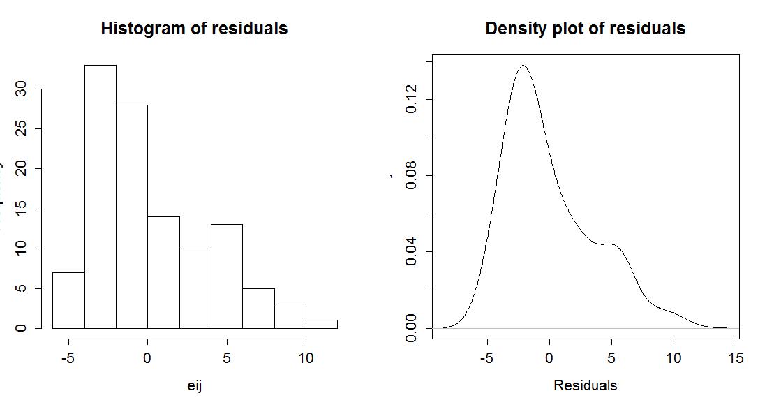
Figure 2-10 shows that there is a right skew present in the residuals, which is consistent with the initial assessment of some right skew in the plots of observations in each group.
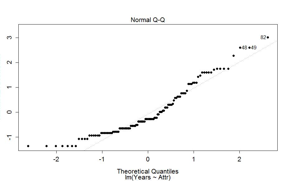
A Quantile-Quantile plot (QQ-plot) shows the "match" of an observed distribution with a theoretical distribution, almost always the normal distribution. They are also known as Quantile Comparison, Normal Probability, or Normal Q-Q plots, with the last two names being specific to comparing results to a normal distribution. In this version24 , the QQ-plots display the value of observed percentiles in the residual distribution on the y-axis versus the percentiles of a theoretical normal distribution on the x-axis. If the observed distribution of the residuals matches the shape of the normal distribution, then the plotted points should follow a 1-1 relationship. If the points follow the displayed straight line that suggests that the residuals have a similar shape to a normal distribution. Some variation is expected around the line and some patterns of deviation are worse than others for our models, so you need to go beyond saying "it does not match a normal distribution" and be specific about the type of deviation you are detecting. And to do that, we need to practice interpreting some QQ-plots.
I extracted the previous QQ-plot of the linear model residuals and enhanced it a little to make Figure 2-11. We know from looking at the histogram that this is a slightly right skewed distribution. The QQ-plot places the observed standardized25 residuals on the y-axis and the theoretical normal values on the x-axis. The most noticeable deviation from the 1-1 line is in the lower left corner of the plot. These are for the negative residuals (left tail) and there are many residuals at around the same value a little smaller than -1. If the distribution had followed the normal here, the points would be on the 1-1 line and would actually be even smaller. So we are not getting as much spread in the lower observations as we would expect in a normal distribution. If you go back to the histogram you can see that the lower observations are all stacked up and do not spread out like the left tail of a normal distribution should. In the right tail (positive) residuals, there is also a systematic lifting from the 1-1 line to larger values in the residuals than the normal would generate. For example, the point labeled as "82" (the 82nd observation in the data set) has a value of 3 in residuals but should actually be smaller (maybe 2.5) if the distribution was normal. Put together, this pattern in the QQ-plot suggests that the left tail is too compacted (too short) and the right tail is too spread out - this is the right skew we identified from the histogram and density curve!
Generally, when both tails deviate on the same side of the line (forming a sort of quadratic curve, especially in more extreme cases), that is evidence of a skew. To see some different potential shapes QQ-plots, six different data sets are Figures 2-12 and 2-13. In each row, a QQ-plot and density curve are displayed. If the points are both above the 1-1 line in the lowr and upper tails as in Figure 2-12(a), then the pattern is a right skew, here even more extreme than in the real data set. If the points are below the 1-1 line in both tails as in Figure 2-12(c), then the pattern should be identified as a left skew. These are both problematic for models that assume normally distributed responses but not necessarily for our permutation approaches if all the groups have similar skewed shapes. The other problematic pattern is to have more spread than a normal curve as in Figure2-12(e) and (f). This shows up with the points being below the line in the left tail (more extreme negative than expected by the normal) and the points being above the line for the right tail (more extreme positive than the normal). We call these distributions heavy-tailed and can manifest as distributions with outliers in both tails or just a bit more spread out than a normal distribution. Heavy-tailed residual distributions can be problematic for our models as the variation is greater than what the normal distribution can account for and our methods might under-estimate the variability in the results. The opposite pattern with the left tail above the line and the right tail below the line suggests less spread (lighter-tailed) than a normal as in Figure 2-12(g) and (h). This pattern is relatively harmless and you can proceed with methods that assume normality safely.
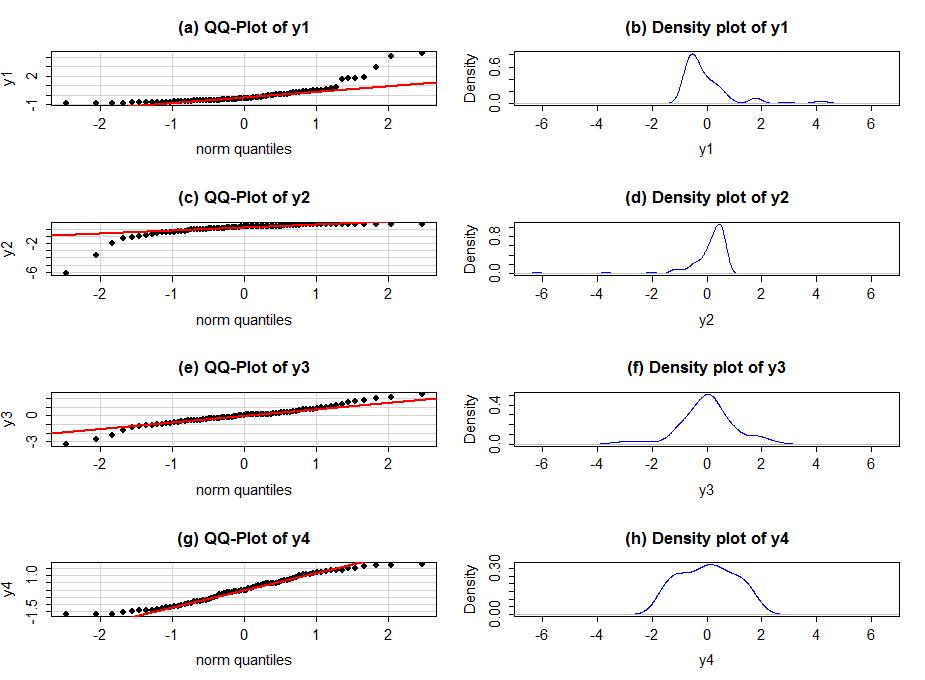
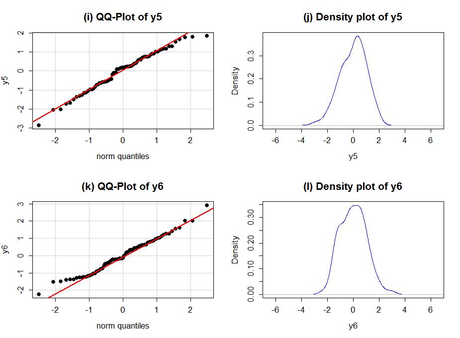
Finally, to help you calibrate expectations for data that are actually normally distributed, two data sets simulated from normal distributions are displayed below in Figure 2-13. Note how neither follows the line exactly but that the overall pattern matches fairly well. You have to allow for some variation from the line in real data sets and focus on when there are really noticeable issues in the distribution of the residuals such as those displayed above.
The last issues with assessing the assumptions in an ANOVA relates to situations where the models are more or less resistant26. to violations of assumptions. For reasons beyond the scope of this class, the parametric ANOVA F-test is more resistant to violations of the assumptions of the normality and equal variance assumptions if the design is balanced. A balanced design occurs when each group is measured the same number of times. The resistance decreases as the data set becomes less balanced, so having close to balance is preferred to a more imbalanced situation if there is a choice available. There is some intuition available here - it makes some sense that you would have better results if all groups are equally (or nearly equally) represented in the data set. We can check the number of observations in each group to see if they are equal or similar using the tally function from the mosaic package:
> tally(~Attr,data=MockJuryR)
| Beautiful | Average | Unattractive | Total |
| 39 | 38 | 37 | 114 |
So the sample sizes do vary among the groups and the design is technically not balanced, but it is also very close to being balanced. This tells us that the F-test so should have some resistance to violations of assumptions. This nearly balanced design, and the moderate sample size, make the parametric and nonparametric approaches provide similar results in this data set.
23We have been using this function quite a bit to make multi-panel graphs but you will always want to use this command for linear model diagnostics or your will have to use the arrows above the plots to go back and see previous plots.
24Along with multiple names, there is variation of what is plotted on the x and y axes and the scaling of the values plotted, increasing the challenge of interpreting QQ-plots. We will try to be consistent about the x and y axis choices.
25Here this means re-scaled so that they should have similar scaling to a standard normal with mean 0 and standard deviation 1. This does not change the shape of the distribution but can make outlier identification by value of the residuals simpler - having a standardized residual more extreme than 5 or -5 would suggest a deviation from normality. But mainly focus on the shape of the pattern in the QQ-plot.
26A resistant procedure is one that is not severely impacted by a particular violation of an assumption. For example, the median is resistant to the impact of an outlier.