1.0 - Histograms, boxplots, and density curves
by
Part of learning statistics is learning to correctly use the terminology, some of which is used colloquially differently than it is used in formal statistical settings. The most commonly "misused" term is data. In statistical parlance, we want to note the plurality of data. Specifically, datum is a single measurement, possibly on multiple random variables, and so it is appropriate to say that "a datum is...". Once we move to discussing data, we are now referring to more than one observation, again on one, or possibly more than one, random variable, and so we need to use "data are..." when talking about our observations. We want to distinguish our use of the term "data" from its more colloquial7 usage that often involves treating it as singular and to refer to any sort of numerical information. We want to use "data" to specifically refer to measurements of our cases or units. When we summarize the results of a study (say providing the mean and SD), that information is not "data". We used our data to generate that information. Sometimes we also use the term "data set" to refer to all of our observations and this is a singular term to refer to the group of observations and this makes it really easy to make mistakes on the usage of this term.
It is also really important to note that variables have to vary - if you measure the sex of your subjects but are only measuring females, then you do not have an interesting variable. The last, but probably most important, aspect of data is the context of the measurement. The who, what, when, and where of the collection of the observations is critical to the sort of conclusions we will make based on the observations. The information on the study design will provide the information required to assess the scope of inference of the study. Generally, remember to think about the research questions the researchers were trying to answer and whether their study actually would answer those questions. There are no formulas to help us sort some of these things out, just critical thinking about the context of the measurements.
To make this concrete, consider the data collected from a study (Plaster, 1989) to investigate whether perceived physical attractiveness had an impact on the sentences or perceived seriousness of a crime that male jurors might give to female defendants. The researchers showed the participants in the study (men who volunteered from a prison) pictures of one of three young women. Each picture had previously been decided to be either beautiful, average, or unattractive by the researchers. Each "juror" was randomly assigned to one of three levels of this factor (which is a categorical predictor or explanatory variable) and then each rated their picture on a variety of traits such as how warm or sincere the woman appeared. Finally, they were told the women had committed a crime (also randomly assigned to either be told she committed a burglary or a swindle) and were asked to rate the seriousness of the crime and provide a suggested length of sentence. We will bypass some aspects of their research and just focus on differences in the sentence suggested among the three pictures. To get a sense of these data, let's consider the first and last parts of the data set:
| Subject | Attr | Crime | Years | Serious | independent | Sincere |
| 1 | Beautiful | Burglary | 10 | 8 | 9 | 8 |
| 2 | Beautiful | Burglary | 3 | 8 | 9 | 3 |
| 3 | Beautiful | Burglary | 5 | 5 | 6 | 3 |
| 4 | Beautiful | Burglary | 1 | 3 | 9 | 8 |
| 5 | Beautiful | Burglary | 7 | 9 | 5 | 1 |
| ... | ... | ... | ... | ... | ... | ... |
| 108 | Average | Swindle | 3 | 3 | 5 | 4 |
| 109 | Average | Swindle | 3 | 2 | 9 | 9 |
| 110 | Average | Swindle | 2 | 1 | 8 | 8 |
| 111 | Average | Swindle | 7 | 4 | 9 | 1 |
| 112 | Average | Swindle | 6 | 3 | 5 | 2 |
| 113 | Average | Swindle | 12 | 9 | 9 | 1 |
| 114 | Average | Swindle | 8 | 8 | 1 | 5 |
When working with data, we should always start with summarizing the sample size. We will use n for the number of subjects in the sample and denote the population size (if available) with N. Here, the sample size is n=114. In this situation, we do not have a random sample from a population (these were volunteers from the population of prisoners at the particular prison) so we can not make inferences to a larger group. But we can assess whether there is a causal effect8: if sufficient evidence is found to conclude that there is some difference in the responses across the treated groups, we can attribute those differences to the treatments applied, since the groups should be same otherwise due to the pictures being randomly assigned to the "jurors". The story of the data set - that it is was collected on prisoners - becomes pretty important in thinking about the ramifications of any results. Are male prisoners different from the population of college males or all residents of a state such as Montana? If so, then we should not assume that the detected differences, if detected, would also exist in some other group of male subjects. The lack of a random sample makes it impossible to assume that this set of prisoners might be like other prisoners. So there will be some serious caution with the following results. But it is still interesting to see if the pictures caused a difference in the suggested mean sentences, even though the inferences are limited to this group of prisoners. If this had been an observational study (suppose that the prisoners could select one of the three pictures), then we would have to avoid any of the "causal" language that we can consider here because the pictures were randomly assigned to the subjects. Without random assignment, the explanatory variable of picture choice could be confounded with another characteristic of prisoners that was related to which picture the selected, and that other variable might be the reason for the differences in the responses provided.
Instead of loading this data set into R using the "Import Dataset" functionality, we can load a R package that contains the data, making for easy access to this data set. The package called heplots (Fox, Friendly, and Monette, 2013) contains a data set called MockJury that contains the results of the study. We will also rely the R package called mosaic (Pruim, Kaplan, and Horton, 2014) that was introduced previously. First (but only once), you need to install both packages, which can be done using the install.packages function with quotes around the package name:
> install.packages("heplots")
After making sure that the packages are installed, we use the require function around the package name (no quotes now!) to load the package.
> require(heplots)
> require(mosaic)
To load the data set that is in a loaded package, we use the data function.
> data(MockJury)
Now there will be a data.frame called MockJury available for us to analyze. We can find out more about the data set as before in a couple of ways. First, we can use the View function to provide a spreadsheet sort of view in the upper left panel. Second, we can use the head and tail functions to print out the beginning and end of the data set. Because there are so many variables, it may wrap around to show all the columns.
> View(MockJury)
> head(MockJury)
| Attr | Crime | Years | Serious | exciting | calm | independent | Sincere | warm | phyattr | |
| 1 | Beautiful | Burglary | 10 | 8 | 6 | 9 | 9 | 8 | 5 | 9 |
| 2 | Beautiful | Burglary | 3 | 8 | 9 | 5 | 9 | 3 | 5 | 9 |
| 3 | Beautiful | Burglary | 5 | 5 | 3 | 4 | 6 | 3 | 6 | 7 |
| 4 | Beautiful | Burglary | 1 | 3 | 3 | 6 | 9 | 8 | 8 | 9 |
| 5 | Beautiful | Burglary | 7 | 9 | 1 | 1 | 5 | 1 | 8 | 8 |
| 6 | Beautiful | Burglary | 7 | 9 | 1 | 5 | 7 | 5 | 8 | 8 |
| sociable | kind | intelligent | strong | sophisticated | happy | ownPA | ||||
| 1 | 9 | 9 | 6 | 9 | 9 | 5 | 9 | |||
| 2 | 9 | 4 | 9 | 5 | 5 | 5 | 7 | |||
| 3 | 4 | 2 | 4 | 5 | 4 | 5 | 5 | |||
| 4 | 9 | 9 | 9 | 9 | 9 | 9 | 9 | |||
| 5 | 9 | 4 | 7 | 9 | 9 | 8 | 7 | |||
| 6 | 9 | 5 | 8 | 9 | 9 | 9 | 9 |
| Attr | Crime | Years | Serious | exciting | calm | independent | Sincere | warm | phyattr | |
| 109 | Average | Swindle | 3 | 2 | 7 | 6 | 9 | 9 | 6 | 4 |
| 110 | Average | Swindle | 2 | 1 | 8 | 8 | 8 | 8 | 8 | 8 |
| 111 | Average | Swindle | 7 | 4 | 1 | 6 | 0 | 1 | 1 | 1 |
| 112 | Average | Swindle | 6 | 3 | 5 | 3 | 5 | 2 | 4 | 1 |
| 113 | Average | Swindle | 12 | 9 | 1 | 9 | 9 | 1 | 1 | 1 |
| 114 | Average | Swindle | 8 | 8 | 1 | 9 | 1 | 5 | 1 | 1 |
| sociable | kind | intelligent | strong | sophisticated | happy | ownPA | ||||
| 109 | 7 | 6 | 8 | 6 | 5 | 7 | 2 | |||
| 110 | 9 | 9 | 9 | 9 | 9 | 9 | 6 | |||
| 111 | 9 | 4 | 1 | 1 | 1 | 9 | 6 | |||
| 112 | 4 | 9 | 3 | 3 | 9 | 5 | 3 | |||
| 113 | 9 | 1 | 9 | 9 | 1 | 9 | 1 | |||
| 114 | 9 | 1 | 1 | 9 | 5 | 1 | 1 |
When data sets are loaded from packages, there is often extra documentation available about the data set which can be accessed using the help function.
> help(MockJury)
With many variables in a data set, it is often useful to get some quick information about all of them; the summary function provides useful information whether the variables are categorical or quantitative and notes if any values were missing.
> summary(MockJury)
| Attr | Crime | Years | Serious | exciting |
| Beautiful :39 | Burglary :59 | Min. :1.000 | Min. :1.000 | Min. :1.000 |
| Average :38 | Swindle :55 | 1st Qu. 2.000 | 1st Qu. 3.000 | 1st Qu. 3.000 |
| Unattractive:37 | Median :3.000 | Median :5.000 | Median :5.000 | |
| Mean :4.693 | Mean :5.010 | Mean :4.658 | ||
| 3rd Qu. :7.000 | 3rd Qu. :6.750 | 3rd Qu. :6.000 | ||
| Max. :15.000 | Max. :9.000 | Max. :9.000 | ||
| calm | independent | Sincere | warm | phyattr |
| Min. :1.000 | Min. :1.000 | Min. :1.000 | Min. :1.00 | Min. :1.00 |
| 1st Qu. :4.250 | 1st Qu. :5.000 | 1st Qu. :3.000 | 1st Qu. :2.00 | 1st Qu. :2.00 |
| Median :6.500 | Median :5.000 | Median :5.000 | Median :5.00 | Median :5.00 |
| Mean :5.982 | Mean :6.132 | Mean :4.789 | Mean :4.57 | Mean :4.93 |
| 3rd Qu. :8.000 | 3rd Qu. :8.000 | 3rd Qu. :7.000 | 3rd Qu. :7.00 | 3rd Qu. :8.00 |
| Max. :9.000 | Max. :9.000 | Max. :9.000 | Max. :9.00 | Max. :9.00 |
| sociable | kind | intelligent | strong | sophisticated |
| Min. :1.000 | Min. :1.000 | Min. :1.000 | Min. :1.00 | Min. :1.00 |
| 1st Qu. :5.000 | 1st Qu. :3.000 | 1st Qu. :4.000 | 1st Qu. :4.000 | 1st Qu. :3.250 |
| Median :7.000 | Median :5.000 | Median :7.000 | Median :6.000 | Median :5.000 |
| Mean :6.132 | Mean :4.728 | Mean :6.096 | Mean :5.649 | Mean :5.061 |
| 3rd Qu. :8.000 | 3rd Qu. :7.000 | 3rd Qu. :8.750 | 3rd Qu. :7.000 | 3rd Qu. :7.000 |
| Max. :9.000 | Max. :9.000 | Max. :9.000 | Max. :9.000 | Max. :9.000 |
| happy | ownPA | |||
| Min. :1.000 | Min. :1.000 | |||
| 1st Qu. :3.000 | 1st Qu. :5.000 | |||
| Median :5.000 | Median :6.000 | |||
| Mean :5.061 | Mean :6.377 | |||
| 3rd Qu. :7.000 | 3rd Qu. :9.000 | |||
| Max. :9.000 | Max. :9.000 |
This violates some rules about the amount of numbers to show versus useful information, but if we take a few moments to explore the output we can discover some useful aspects of the data set. The output is organized by variable, providing some summary information, either counts by category for categorical variables or the 5-number summary plus the mean for quantitative variables. For the first variable, called Attr in the data.frame and that we might more explicitly name Attractiveness, we find counts of the number of subjects shown each picture: 37/114 viewed the "Unattractive" picture, 38 viewed "Average", and 39 viewed "Beautiful". We can also see that suggested sentences (data.frame variable Years) ranged from 1 year to 15 years with a median of 3 years. It seems that all of the other variables except for Crime (type of crime that they were told the pictured woman committed) contained responses between 1 and 9 based on rating scales from 1=low to 9 =high.
To accompany the numerical summaries, histograms and boxplots can provide some initial information on the shape of the distribution of the responses for the suggested sentences in Years. Figure 1-1 contains the histogram and boxplot of Years, ignoring any information on which picture the "jurors" were shown. The code is enhanced slightly to make it better labeled
> hist(MockJury$Years,xlab="Years",labels=T,main="Histogram of Years")
> boxplot(MockJury$Years,ylab="Years",main="Boxplot of Years")
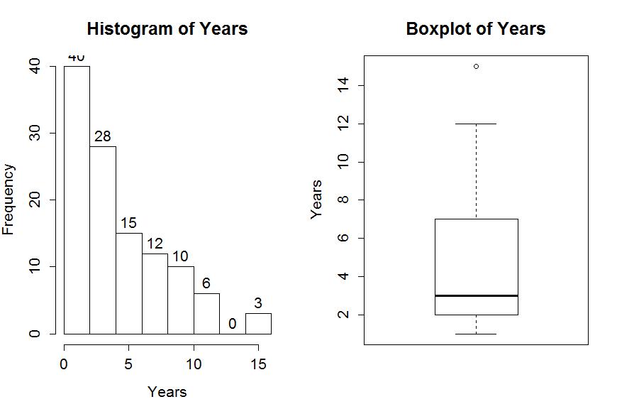
The distribution appears to have a strong right skew with three observations at 15 years flagged as potential outliers. They seem to just be the upper edge of the overall pattern of a strongly right skewed distribution, so we certainly would want want to ignore them in the data set. In real data sets, outliers are common and the first step is to verify that they were not errors in recording. The next step is to study their impact on the statistical analyses performed, potentially considering reporting results with and without the influential observation(s) in the results. Sometimes the outliers are the most interesting part of the data set and should not always be discounted.
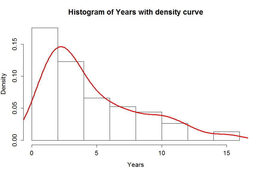
Often when we think of distributions, we think of the smooth underlying shape that led to the data set realized in the histogram. Instead of binning up observations and making bars in the histogram, we can estimate what is called a density curve as a smooth curve that represents the observed distribution. Density curves can sometimes help us see features of the data sets more clearly. To understand the density curve, it is useful to initially see the histogram and density curve together. The density curve is scaled so that the total area9 under the curve is 1. To make a comparable histogram, the y-axis needs to be scaled so that the histogram is also on the "density" scale which makes the heights of the bars the height needed so that the proportion of the total data set in each bar is represented by the area in each bar (height times width). So the height depends on the width of the bars and the total area across all the bars is 1. In the hist function, the freq=F option does this required re-scaling. The density curve is added to the histogram using lines (density()), producing the result in Figure 1-2 with added modifications of options for lwd (line width) and col (color) to make the plot more interesting. You can see how density curve somewhat matches the histogram bars but deals with the bumps up and down and edges a little differently. We can pick out the strong right skew using either display and will rarely make both together.
> hist(MockJury$Years,freq=F,xlab="Years",main="Histogram of Years with density curve")
> lines(density(MockJury$Years),lwd=3,col="red")
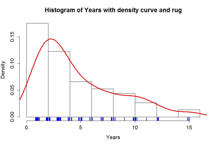
Histograms can be sensitive to the choice of the number of bars and even the cut-offs used to define the bins for a given number of bars. Small changes in the definition of cut-offs for the bins can have noticeable impacts on the shapes observed but this does not impact density curves. We are not going to over-ride the default choices for bars in histogram, but we can add information on the original observations being included in each bar. In the previous display, we can add what is called a rug to the plot, were a tick mark is made for each observation. Because the responses were provided as whole years (1, 2, 3, ..., 15), we need to use a graphical technique called jittering to add a little noise10 to each observation so all observations at each year value do not plot at the same points. In Figure 1-3, the added tick marks on the x-axis show the approximate locations of the original observations. We can clearly see how there are 3 observations at 15 (all were 15 and the noise added makes it possible to see them all. The limitations of the histogram arise around the 10 year sentence area where there are many responses at 10 years and just one at both 9 and 11 years, but the histogram bars sort of miss this that aspect of the data set. The density curve did show a small bump at 10 years. Density curves are, however, not perfect and this one shows area for sentences less than 0 years which is not possible here.
> hist(MockJury$Years,freq=F,xlab="Years",main="Histogram of Years with density curve and rug")
> lines(density(MockJury$Years),lwd=3,col="red")
> rug(jitter(MockJury$Years),col="blue",lwd=2)
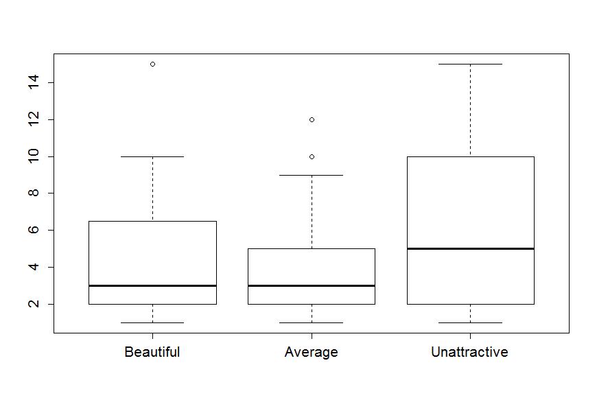
The tools we've just discussed are going to help us move to comparing the distribution of responses across more than one group. We will have two displays that will help us make these comparisons. The simplest is the side-by-side boxplot, where a boxplot is displayed for each group of interest using the same y-axis scaling. In R, we can use its formula notation to see if the response (Years) differs based on the group (Attr) by using something like Y~X or, here,Years~Attr. We also need to tell R where to find the variables and use the last option in the command, data=DATASETNAME, to inform R of the data.frame to look in to find the variables. In this example, data=MockJury. We will use the formula and data=... options in almost every function we use from here forward. Figure 1-4 contains the side-by-side boxplots showing right skew for all the groups, slightly higher median and more variability for the Unattractive group along with some potential outliers indicated in two of the three groups.
> boxplot(Years~Attr,data=MockJury)
The "~" (the tilde symbol, which you can find in the upper left corner of your keyboard) notation will be used in two ways this semester. The formula use in R employed previously declares that the response variable here is Years and the explanatory variable is Attr. The other use for "~" is as shorthand for "is distributed as" and is used in the context of Y~N(0,1), which translates (in statistics) to defining the random variable Y as following a normal distribution with mean 0 and standard deviation of 1. In the current situation, we could ask whether the Years variable seems like it may follow a normal distribution, in other words, is Years~N(μ, σ)? Since the responses are right skewed with some groups having outliers, it is not reasonable to assume that the Years variable for any of the three groups may follow a Normal distribution (more later on the issues this creates!). Remember that μ and σ are parameters where μ is our standard symbol for the population mean and that σ is the symbol of the population standard deviation.
7You will more typically hear "data is" but that more often refers to information, sometimes even statistical summaries of data sets, than to observations collected as part of a study, suggesting the confusion of this term in the general public. We will explore a data set in Chapter 4 related to perceptions of this issue collected by researchers at http://fivethirtyeight.com.
8We will try to reserve the term "effect" for situations where random assignment allows us to consider causality as the reason for the differences in the response variable among levels of the explanatory variable, if we find evidence against the null hypothesis of no difference.
9If you've taken calculus, you will know that the curve is being constructed so that the integral from −∞ to ∞ is 1.
10Jittering typically involves adding random variability to each observation that is uniformly distributed in a range determined based on the spacing of the observations. If you re-run the jitter function, the results will change. For more details, type help(jitter) in R.